Hospital Wayfinding: There is no excuse for a visitor to get lost in your building again, ever.

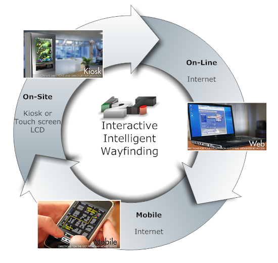
The following describes a full circle interactive wayfinding system for a Hospital:
- On-site, through a LCD touch screen and use of Smart-Phone;
- Online, through an online wayfinding system attached to your homepage
- With department-to-department directions
…and your staff/volunteers can use the same wayfinding system too:
- Include directions when they make an appointment with a patient. These directions can be retrieved on PC and Smart-Phone. Down to where to park.
- Generate directions and print them out for visitors who bypass the On-Site LCD interactive touch screen.
- Include a ‘Find Me’ button in e-mails for business appointments. Again, the directions can be retrieved through PC and Smart-Phone.
…while the retrieved wayfinding information always shows the:
- Latest information, Even if in-between making the appointment and retrieving the directions a hall is closed-off due to construction, or the doctor moved to another department, or a whole department moved to another location inside the hospital. The route information is automatically updated!
This copywrited post, by , CEO of www.here2theresoftware.com, is about Indoor Interactive Wayfinding offered through on-site LCD touch screens and on-line (through the internet) for PC and Mobile Phone. Feel free to link to this post.
Wayfinding Introduction:
Successful wayfinding involves knowing where you are, knowing your destination, knowing and following the best route to your destination, being able to recognize your destination upon arrival, and reversing the process to find your way back out (Carpman & Grant, 1993).
Requirements (On-Site Interactive Indoor Wayfinding System)
- Easy to spot
- Obvious in its intend
- Easy to approach (physically and mentally)
- Shows position of visitor
- Allows to select destination
- Generates the route
- Offers ‘print route’ feature
- Print includes photo of destination
- Process very straightforward and self-explanatory
Key words: ‘Where’ and ‘How’
A successful wayfinding system depends on ‘where’ and ‘how’ it is offered. A) Location, B) hardware used and C) software designed (graphical and logical) can make or break the wayfinding service. The ‘how’ also pertains to how well it is designed to cater the population that visits the hospital and their state of mind:
- The visitors to a Hospital will be a mix of all ages, but with a good portion of them, senior citizens.
- Visiting a Hospital, or going there for treatment, raises the anxiety levels. More for some, less for others, but present all the same.
Combine the wayfinding application with other apps on the Kiosk or LCD?
Important: If you can get away with it, do not share the kiosk/LCD touch with other apps. like patient check-in, registration systems or other. If you do, you are likely to get 10-25% less usage. Why? Because you break the following rules: ‘Easy to Spot’, ‘Obvious in its intend’ (and most likely also ‘Easy to Use’, as you have added extra steps to the process’). You have 1 second of attention to make the penny drop, use it as wisely as you can.
Unfortunately, this is not how we think. We like to combine and save costs. We also think its easier for the visitor to have it all under their hands.
Well,…it isn’t. It is confusing and as such affects overall usage of all systems involved, not only wayfinding. But most of all, it is not cost efficient, as significantly less users will use your system, making the investment almost mute.
A). Location
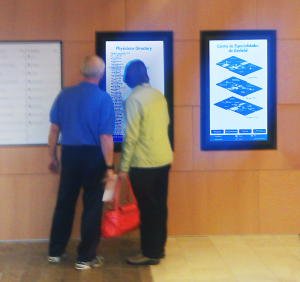
Place the wayfinding system as close to the entrance(s) as possible, but outside the beaten path. The hospital may already have a static directory in the lobby somewhere. That is where it needs to be. Provide enough room for wheelchair access. For large buildings it deserves recommendation to place a system on the other floors as well, close to the elevators.
 Vertical Orientation of the LCD prefered
B) Kiosk or Touch Screen LCD?
Definitely Touch Screen LCD
C). Wayfinding Software Design
-
Graphical Design
-
Logical Design
-
Graphical Design:
Layout of the interface
- Maps: Simple and straightforward. The more ‘bling’, the less chance the message comes across. Mark public facilities, stairways, elevators and emergency exits with icons and explain them in the legend. Make rest-rooms stand out (more often than not, the first thing visitors will look for when they enter your building). Slight skewed maps will give a better sense of space, distance and direction.
- Navigation: Represented by buttons. Make them large, the text self-explanatory and present them clustered in a designated area. 4-6 buttons is the maximum per page. If you need more buttons you could be over-complicating the process.
- Legend: Explains the icons used on the map. Make sure the icons are universal, self-explanatory, black-on-white representations.
Colors
I am going to throw out a few terms here that graphic designers well understand:
- Color-Harmony
- Contrast
And leave it at that, as I am no graphic designer. The main idea is that the immediate purpose of a page jumps out. For example: on the ‘You Are Here’ page, a clear dot or other marking should be dominating, indicating the position of the visitor. If my attention isn’t immediately drawn to that spot, you failed. Also, keep in mind that 9-12% of the male users are color blind (I know I am).
Fonts:
use not more then 2 different fonts or 2-3 different font-sizes. It helps with keeping the peace in your art-work.
Overall:
Balance the information and indicate clearly what the user needs to do next. Keep a lot of ‘whitespace’ (rest-areas). A lot of users will be elderly and can’t process a tsunami of information or a lot of users are like me, with very little patience.
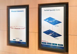
 Medical Center installation by H2T
- Logical Design:
Process of Navigation: Keep it simple. The faster the route is obtained, the better it is. I like 3 pages (related: Where Am I?):
- 1) You Are Here
- 2) Select destination
- 3) Show directions.
You can have a welcome page first with your logo, an eye-catcher and a language selection option but you lose the opportunity to show a map immediately. People look for maps right away when they enter an unfamiliar building.
You also miss out on the opportunity to show the visitor immediately where he/she is and how the lay-out of the rest of the building looks like, which takes some of the anxiety away. With a welcome screen, they have to click through that first before they see the map.
In retrospect, the rotating eye-catcher may nullify this concern. I am still torn on this subject, but lean towards my 1, 2 and 3 screen without a welcome screen. Two LCD’s next to each-other, as pictured, is the best of both worlds with an outcome, better than the sum of each.
Data-Driven Wayfinding:
The biggest challenge that every wayfinding software developer has, is letting the wayfinding application know where all the points of interest are and which hallways are accessible for the public and to be able to call them upon request. The algorithms used to make a data-driven wayfinding system, borderline the technical know-how of rocket-science specialists.
This data-driven engine is what makes a true wayfinding system, and as mentioned before, the only way to get a good functioning, flexible, expandable and well maintainable wayfinding application. Read here the difference between data-driven and graphical driven (‘Computing Directions‘).
Key characteristics of a data-base driven wayfinding application:
- It knows where all locations are on the grid
- Every location can be a starting point or an end-point
- It knows the locations of every single hallway and intersection on the grid
- By computing it can provide either the fastest route, preferred route, bypass route, alternate route, accessible route or temporary route on-the fly
- Highly flexible, expandable and maintainable by the client itself, after delivery
The biggest financial advantage of this method is unlimited licensing whether you have one kiosk or 100 on different locations inside the building or on the campus.
Maintenance is easy. Hallway under construction? Just right-click and close down. From here on out all and every single route will bypass this hallway. This is what makes the wayfinding system intelligent.
Once the on-site wayfinding system is developed, turning it into an Online Wayfinding System is a breeze. Normally, one of the more complicated features of an online wayfinding system is that it (should) offer department-to-department directions. However, since the On-Site Wayfinding application can turn any point of interest into a starting point or end-point, that is no issue.
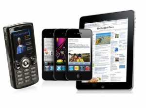
And this one drives it home, because when you have an Online Wayfinding System (accessible through the internet); it is just a small step to make a Mobile Wayfinding System, suited for all Mobile Systems out there. Able to be used, en-route, inside your building.
This almost ‘magic’ emerging of technologies is only possible with a wayfinding system that is based on Data-Driven technology.
But there is more….
Since the system knows where all departments are, and how to get there, from everywhere, there are a few extra cool things you can do:
Example 1: If a physician (or any 3rd party you allow to) makes an appointment for a client with your hospital, they can seamlessly and immediately, include all directions to that department as well (or any department for that matter) and provide the route on paper print, e-mail or text, at any point in time, to the client.
Can even send automatic reminders to the Smart-Phone when the appointment date is nearing.
The visitor can pull these wayfinding instructions up at anytime, anyplace (on PC and make a print or Mobile).
If in-between making an appointment and the actual visit, the directions change, because of a hallway reconstruction or maybe the doctor moved to another office, the directions will automatically reflect this change at the time of visit. Nothing that needs to be done to initiate this.
On a side note: Sending directions to a Mobile Phone allows for visual impaired for a Text-to-Speech setting, having the directions read to them.
Example 2: If a staff member makes an appointment with a business relationship they can include a ‘Directions’ button into their e-mail, which as you know, can be pulled up on a Mobile Phone as well. This button is connected to the Online-Wayfinding System and delivers automatically the latest known directions to the business contact.
Example 3: The online wayfinding system is accessible for everyone connected to the internet. If a visitor entering your hospital decides to skip the on-site wayfinding system and heads straight to the front-desk, the staff member can print the directions for the visitor, using the same wayfinding system.
Other service desks scattered through your building will be able to do the same thing, generate directions on request for patients to take along on their way.
Customers keep coming up with other functionalities as well so as they come in I will just keep adding them.
Never, does a visitor need to get lost again in your building or on your campus.
www.here2theresoftware.com
Phone: USA 814 – 342 – 3120
support@here2theresoftware.com


